Association Website Best Practices: Designing for Success

From the moment someone lands on your homepage, they should feel compelled to explore your website and learn all there is to know about your association. Whether this is their first interaction with your association or they’re a long-time member, your website should make it easy for them to accomplish whatever task they need to carry out.
While every association finds success in different design strategies, there are a few common elements that you should consider when creating your site. With the help of a content management system (CMS) designed specifically for associations, implement these best practices to create an engaging association website:
- Optimize for mobile
- Improve load speed
- Make it accessible
- Check for errors frequently
- Use white space
- Use photos and videos
- Keep your branding consistent
- Make converting easy
Ready to transform your association’s website into an engaging and captivating one? Let’s get started.

Association Website Best Practice #1: Optimize for mobile
Nowadays, mobile users make up the majority of website traffic. In fact, roughly half of all nonprofit website traffic comes from mobile and tablet users, according to recent online giving data. With that in mind, it’s more important than ever that your association prioritizes mobile optimization in its website design.
Whether someone is casually browsing your association’s website or looking to become a member, your CMS should ensure each page is easy to use and read on every screen size. By ensuring your website is built for mobile use, you can avoid negative user experiences, such as:
- Zooming in and out to view content
- Rotating the device to better view the page
- Abandoning the page out of frustration
To increase your association’s visibility online, your website needs to be fully functional on all devices. To streamline this process, ensure your CMS offers automatic mobile optimization and responsiveness. This reduces the amount of manual work necessary because you won’t need to develop multiple versions of your website for smartphones and tablets. When you optimize for mobile devices, you’ll create a positive user experience on your association’s website!
To increase usability and enhance the mobile experience, take a look at more of our tips for designing a mobile-friendly website.
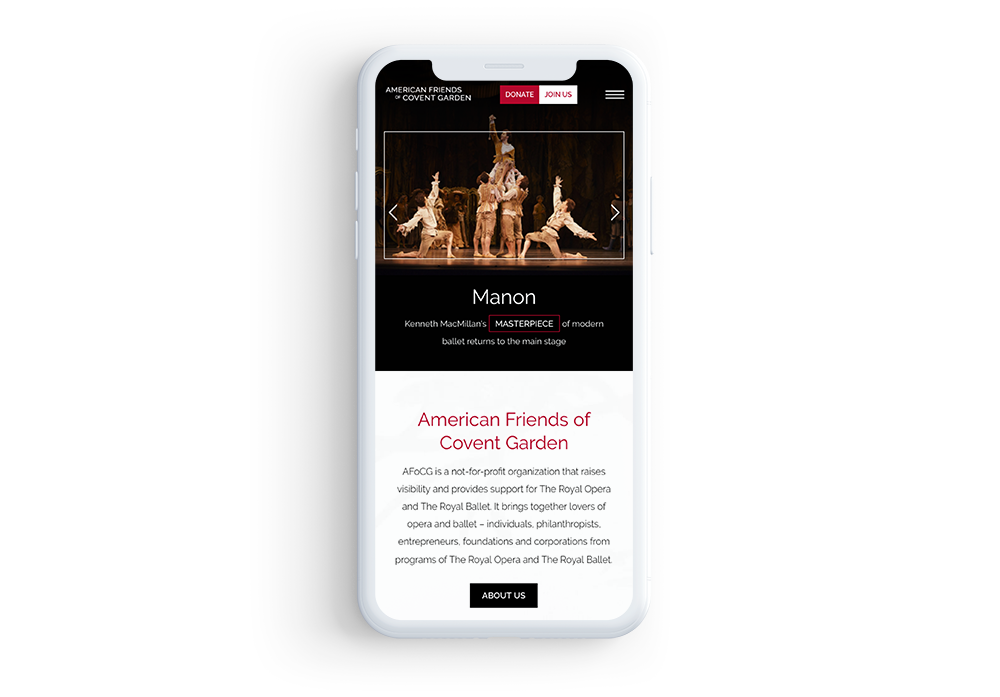
Association websites example: American Friends of Covent Garden
The American Friends of Covent Garden created an engaging association website that captivates users from the moment they land on the homepage. By featuring a mobile responsive design across all pages, the website conveys the most important information effectively and concisely using minimal text and impactful imagery. This improves the user experience by ensuring the information is accessible to all users, no matter what device they’re using. Check out this mobile responsive design:

Association Website Best Practice #2: Improve load speed
From the user’s perspective, one of the most frustrating elements of a website is slow load speed. With poor load speed, you risk a much higher bounce rate (the percentage of people leaving your website after visiting only one page), because no one’s willing to stick around for your content to load. Additionally, research has shown that pages with longer load times tend to negatively impact conversions.
Not only is speed important for a positive user experience, but Google has also indicated that site speed (and as a result, page speed) is one of the signals used by its algorithm for ranking pages. In other words, in order to boost visibility and drive value for your association, you need to prioritize a fast load time. To accomplish this, consider these best practices:
- Compress images before loading them into your site. Images and graphics are usually the main culprit of slow load speeds. Make sure you compress them properly so that they don’t slow down load time but still look presentable and not pixelated.
- Optimize your code. This will need to be completed by a professional web developer. Minifying JavaScript and CSS as well as removing unused code will positively impact page load speed. Choosing a website theme that has already been optimized for load speed will save you the time from having to hire external help.
- Reduce the number of redirects. Redirects can be useful when cleaning up your association’s website, but you’ll want to limit these when possible. This is because each time a page redirects to another page, your visitor must wait for the HTTP request-response cycle to complete.
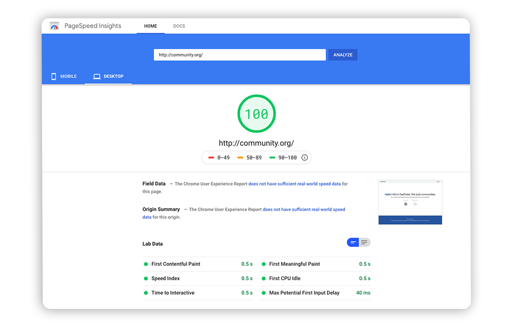
Ensure your CMS offers automatic page speed tools to reduce the amount of manual labor your team needs to do. To gain insight into how to improve your speed, explore Google’s free PageSpeed Insights tools. All you need to do to analyze your page speed is enter the page’s URL. Then, implement its suggestions to improve your load time for both mobile and desktop users.
Association websites example: Community.org
Below, you’ll see an example of Google’s PageSpeed Insights tool in action. After analyzing GasPedal’s web page Community.org, the tool assigned it a rating based on several elements, seen at the bottom of the screenshot. GasPedal did a great job of reducing load time by minimizing the number of elements on this page while still providing value to the reader.

Association Website Best Practice #3: Make it accessible
As an association, you want to make sure all visitors are able to use your site effectively and easily. This means complying with web accessibility standards so that people with disabilities or impairments can still interact with your website.
While most web content accessibility guidelines (WCAG) require the help of a professional developer, there are still many steps you can take on your own, so long as you’re armed with a non-technical CMS. Start by implementing the following best practices:
- Use high contrast colors. Selecting high contrast colors makes it easier for visually-impaired users to read your content. The WCAG 2.1 guidelines require a minimum contrast ratio of 4.5:1 for text and graphics. This way, you ensure that more prospective members can easily read your content.
- Add alt-text to images. Alternative text (or alt-text) is a phrase or sentence added to an image’s HTML coding that describes the appearance of the picture. It’s used for screen reader technology to aid people who are visually impaired. Take advantage of your CMS’ built-in alt-text features to write descriptions for all of your images.
- Offer alternatives for videos. Videos don’t enable alt-text, so you’ll have to take a different approach to describe it to visitors with hearing or visual impairments. Create a written transcript or feature captions in the video. If you link out to a transcript, clearly label the link so that it’s easy to find by screen reader technology.
These are a handful of the ways you can make your website more accessible by all types of users. Continue exploring accessible association website designs with our guide to nonprofit web accessibility.
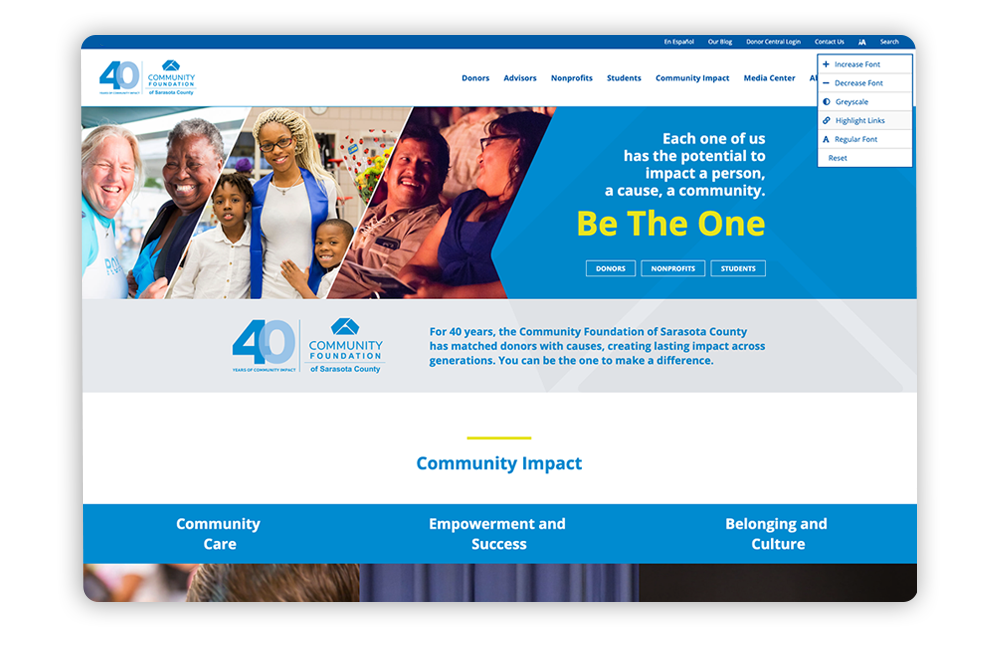
Association website in action: Community Foundation of Sarasota County
On its website, Community Foundation of Sarasota County offers a tool that enables users to adjust their webpage to suit their needs. Take a look at the top right corner of the image below, and you’ll see the user has the option to increase font size, decrease font size, change the colors to greyscale as well as a handful of other choices. This way, users can instantly adjust the page so it’s easier to view without hassle.

Association Website Best Practice #4: Check for errors frequently
Once you’ve designed your website and pushed it live, your work doesn’t stop there. To keep your website running as smoothly as possible, you need to frequently check for errors and consistently update your website, so make sure your team is prepared to do so.
When cleaning up your site, you should be on the lookout for:
- 404 errors. This error occurs when a page has been moved or removed from the website. To fix this, redirect the URL to the new page with similar content. Free online tools can aid in pinpointing these pages, and your CMS will help you quickly redirect them without any hassle.
- Expired content. Expired content refers to content on a site that has an expiration date, such as past events and registration pages. Be sure to hide or redirect these pages to keep your content current.
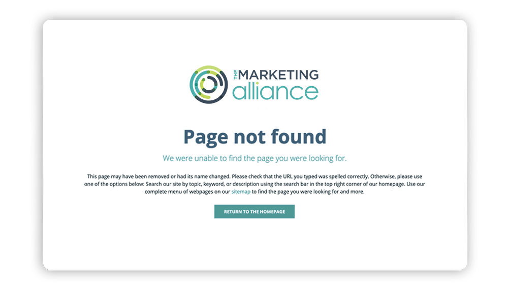
Promptly remove or redirect any page errors to avoid confusion. These pages will inevitably pop up, so you’ll want to make sure you have a well-designed error page that appears in the meantime. By performing regular maintenance on your site, you’ll ensure users have quick access to everything they need and won’t get frustrated by landing on nonexistent or outdated pages.
Association websites example: The Marketing Alliance
The Marketing Alliance did a great job of designing their 404 error page. Instead of showing a generic page that offers no value to users, their team offers a handful of solutions to help the visitor find the page they meant to navigate to, including useful links. Plus, it’s branded to their organization with their color scheme and logo, which generates even more value for the reader. Take a look at their well-designed 404 error page:

Association Website Best Practice #5: Use white space
While you may think white space seems like a “waste of space,” it’s actually an important element of effective web design. Instead of cluttering up your page, white space helps to:
- Break up content and reduce clutter.
- Draw attention to certain content elements.
- Help readers better digest information.
As users surf the web, they tend to have shorter attention spans, which makes using white space especially important. It allows you to limit distractions and focus on getting important information across.
While white space does have its benefits, keep in mind that you need to strike the perfect balance between your white space and content. White space does still take up space, after all. Consider what you’d like to appear above the fold (the part of a webpage that’s visible without scrolling), and adjust the rest of your content from there.
Morweb offers customizable templates that feature an effective balance between white space and content. Use these to quicken the design process and ensure you’re using white space effectively.
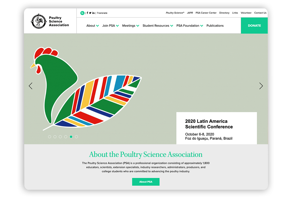
Association website in action: Poultry Science Association
Poultry Science Association features a minimalist design across their website. With strategic use of white space, their most important information catches the user’s eye and ensures the reader doesn’t get distracted by other content. Take a look at Poultry Science Association’s well-balanced homepage:

Association Website Best Practice #6: Use photos and videos
Humans are motivated by compelling visuals. In fact, research shows that posts that feature images produce 650% higher engagement than text-only posts. Because of this, imagery is an important element of association websites.
Powerful visuals bring prospects to your website and keep them engaged as they navigate through each page. They enable you to better illustrate what your association does and to build emotional connections with potential members. Keep in mind these best practices, so you can incorporate visuals in a way that drives value for your association:
- Feature original images. Rather than using generic stock photos, use your own high-quality images. These can be anything from your members to those who are impacted by your work. Real pictures provide social proof and show the actual impact you’re having on your community.
- Be strategic. Don’t clutter your pages with excessive imagery as this can slow your website down and distract users. Instead, use images as a way to support your content and break up large sections of text.
- Regularly update images. Updating your videos and photos signals to site visitors that your content is current and that your association has an active online presence.
With a CMS that offers multimedia capabilities, you can captivate your association website’s visitors from the moment they land on your website. Be selective when choosing imagery in order to keep visitors engaged.
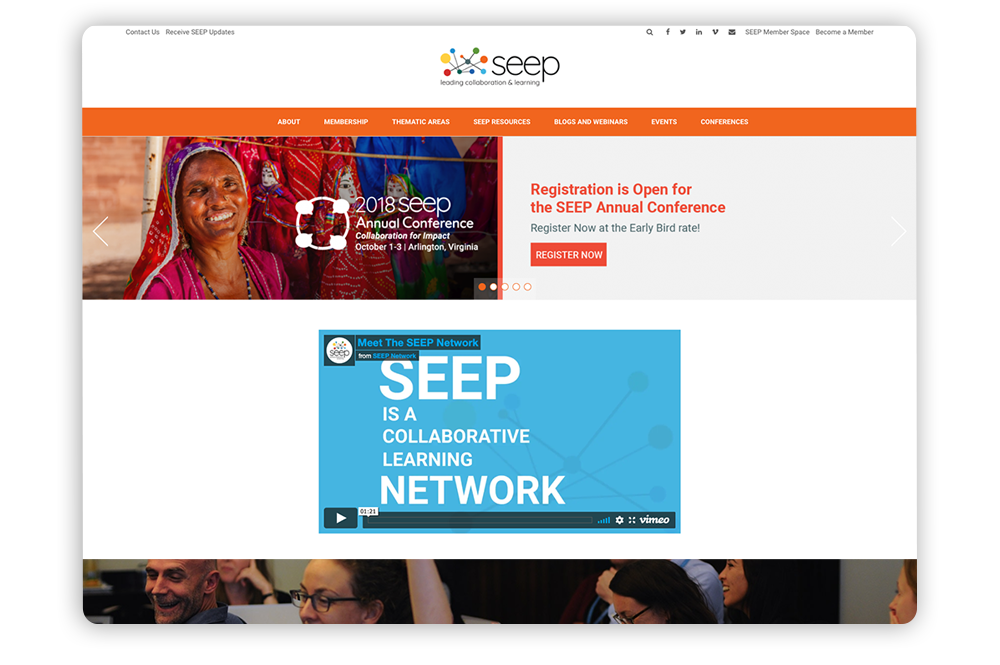
Association websites example: The SEEP Network
The SEEP Network features powerful imagery to captivate readers. Their original images and videos convey their mission in a way that evokes emotion and encourages users to continue exploring the website to learn more. Take a look at the valuable images and video The SEEP Network uses to encourages users to engage:

Association Website Best Practice #7: Keep your branding consistent
Your website is an excellent place to build brand recognition for your association. Effective branding presents a number of benefits for association websites, such as providing a cohesive user experience. When your brand is consistent throughout your site, members and other visitors will come to associate your name, logo, and other branding elements with the good work you do.
Not online does consistent branding improve the user experience, but it is also essential to make your site appear trustworthy. The presence of branding across your website—your donation and membership pages in particular—assures supporters that they are interacting with the right association. This way, they’ll know that their contributions are going to your association.
Incorporate these branding elements to create a more customized and immersive website:
- Logos, font, and colors. Customizing your association website requires a color scheme as well as consistent use of fonts and colors. Improve brand recognition by incorporating each of these elements on every page of your website as well as all other marketing materials.
- Add-on modules. Customize the user experience by incorporating branded add-on modules. With modules such as fundraising storefronts and membership portals, your association can create engagement opportunities of all sorts directly on your website instead of sending users to external sites to get the job done.
- Customizable templates. Your CMS should enable you to brand all elements of your page layout in customized templates, so once you settle on a branded design, you can easily implement it when creating new pages. Morweb’s association website themes are fully customizable for even the most complex brand standards.
Branding is a vital component of engaging association web design. Make sure you’re accurately representing your association by incorporating the above elements on your association’s website.
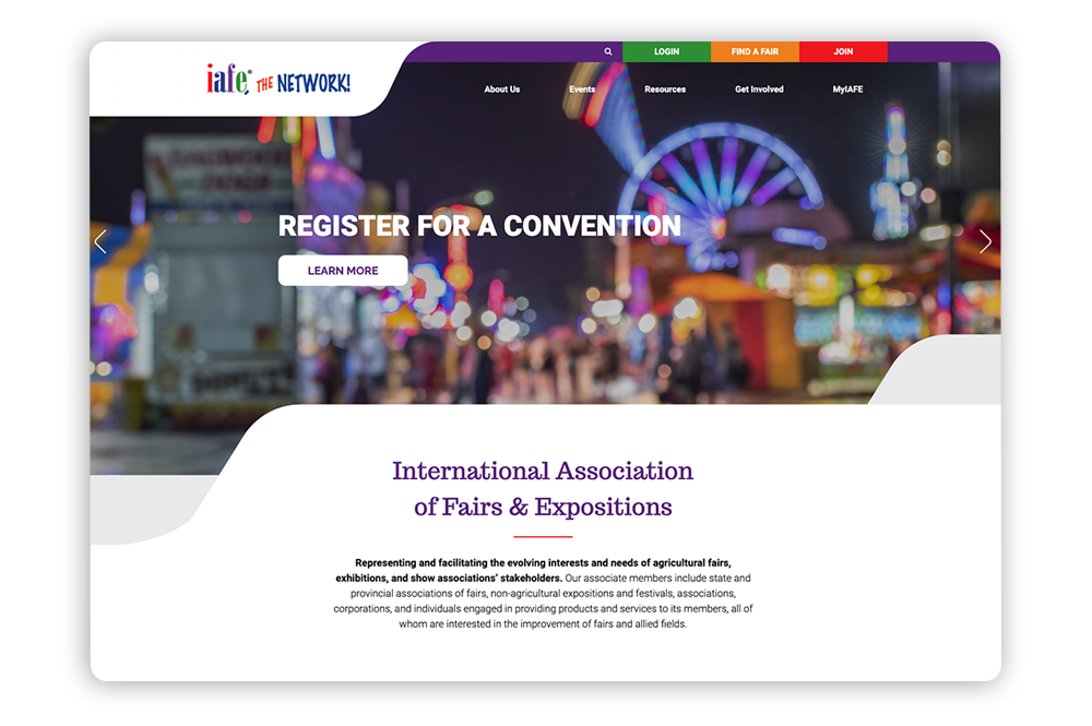
Association website in action: International Association of Fairs & Expositions
The International Association of Fairs & Expositions features consistent branding across their website. Their logo and color scheme are visible across each page, and the entire website features a consistent layout. This reassures users that they haven’t somehow been redirected off of the association’s website. For branding inspiration, check out this organization’s site:

Association Website Best Practice #8: Make converting easy
By implementing the above suggestions, you’re likely to see a boost in traffic to your website. However, what’s even more important is your conversions, whether that’s membership registrations, event sign-ups, donations or any other measurable actions on your website. To keep your supporters converting month after month, they need to feel as though they’re receiving recurring value. In order to accomplish this, all content on your association’s website needs to serve a purpose and encourage visitors to become and remain involved.
Here are a few areas where you should prioritize conversions:
- In your navigation menu. Make it clear what goal you’d like visitors to complete the moment they land on your website. Many associations accomplish this by adding buttons in the upper right corner as part of the navigation menu, linking to the membership login page and donation form. Your navigation is visible across each page on your website, so visitors can access it whenever they’d like.
- At the end of an article. Chances are, you maintain a blog on your website. When you create inspiring posts that encourage readers to take action, make sure they know exactly what their next steps are. Incorporate a call-to-action (CTA) linking to your membership registration page, donation form, and other relevant content to drive conversions.
- On all forms. Filling out a membership application or a donation form is when engagement is at its peak. You’ll want to simplify these forms so that users are more likely to complete the process. For any form, limit the number of fields and give straightforward instructions. Also, encourage prospects to share the page with their social networks by adding social media share buttons. This way, you may reach other like-minded individuals, driving even more conversions.
Your website shouldn’t serve as a dumping ground for text. Design your pages and forms with a conversion-focused mindset with inspiring content, visible buttons, and powerful CTAs. By doing this, you’ll drive more traffic to your high-value pages and boost conversions.
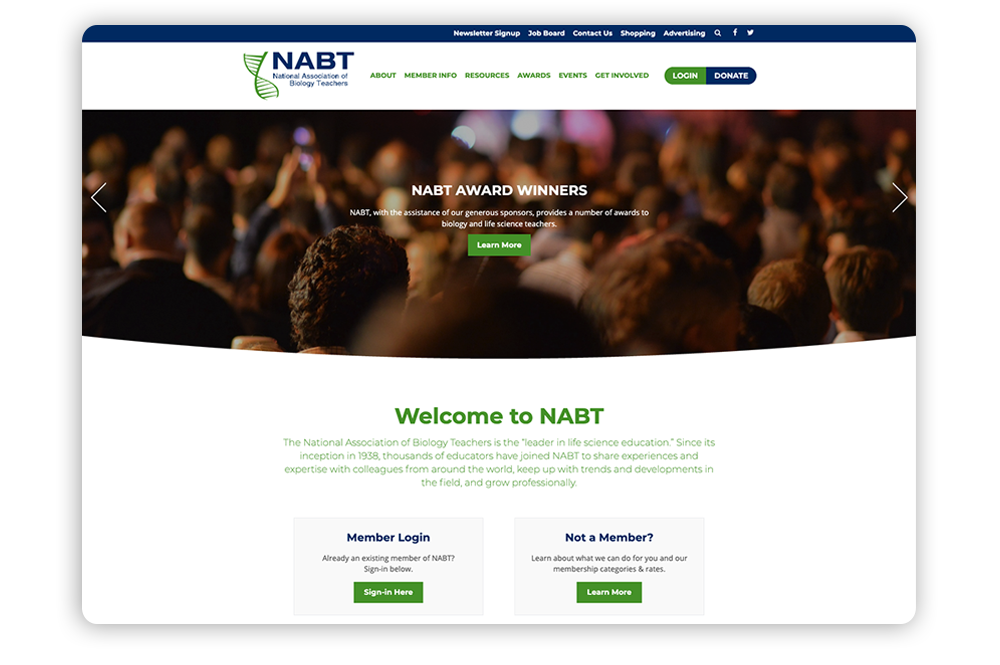
Association website in action: National Association of Biology Teachers
The National Association of Biology Teachers created a website that encourages visitors to continue interacting. The moment a user lands on the homepage, the eye-catching CTAs let them know their available options, which encourages them to further engage with the website. Plus, the ‘Login’ and ‘Donate’ buttons are featured in the navigation, so they’re visible across every page on the website. Take a look at how the National Association of Biology Teachers drives user engagement:
The Gist
An association’s website is its single most important digital channel to maintain. The design process doesn’t have to be a complicated process so long as you implement the above best practices. By designing your association’s website with the user experience in mind, you’ll be able to drive more traffic to your site and ramp up support.
If you’re looking for additional information on association website design best practices, explore the resources below:
- 10 Best Association Websites + Tips For Building Your Own. Explore our list of well-designed association websites. You may be inspired by some of the elements they included.
- Top 11 Membership Website Builders for Associations. Your membership website builder should meet your association’s needs and simplify the design process. Take a look at our list of the most robust tools available.
- Nonprofit Website Design Tips: 15 Ideas for Your Organization. Explore more best practices to implement in your digital strategy. Grow your impact by considering these actionable ideas.
To help you effectively implement the tips covered in this post, select a CMS that simplifies the design process and meets your association’s needs. With Morweb, designing a beautiful association website is possible for everyone. We know exactly what it takes for associations like yours to be successful online, so reach out to our team to get started.